Research Question
How can procedural design combine typographic rules with artistic freedom to create generative fonts with visual impact?
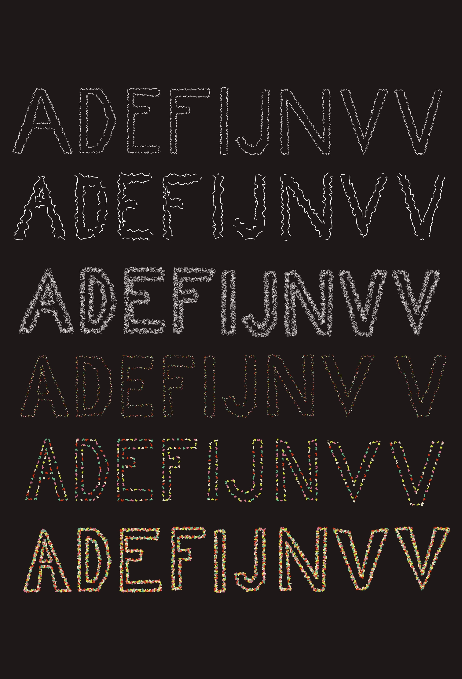
In the demo 02, I also added new letters. However here i didnt really focused on the proportion as I did it in the previous demo. Since logic of distortion and drawing is slightly different, i still needed to adjust drawing of the letters. Due to the lack of the time i decided for now to create letters which have the same height, but their other apperance slightly differs. However thanks to the possibility of using circles i can still manipulate letter and eventually adjust it as I need. This demo showcases how distortion, proportional division, and animation can be combined to create unique letter.
Distortion Technique
The core of this demo lies in the distortion of edges. By applying random offsets to the vertices of each letter, we introduce a controlled chaos that gives each letter a unique, organic feel. This is achieved by calculating the distance between points and dividing it into segments. Each segment is then slightly displaced using a random value within a specified range, known as the deformationAmount. This randomness ensures that no two renderings are identical, adding a layer of unpredictability and intrigue to the artwork.
Distortion
I make the edges of the letters look unique by moving their points randomly. This randomness means each letter looks different every time I run the demo. I split the edges into segments and move each segment a bit using a random value. This gives the letters a unpredictable look. In this demo, I selected randomness over noise to drive the distortion process. While noise offers smooth, continuous variations, randomness introduces a level of unpredictability and spontaneity, ensuring that each rendering is distinct and full of surprises.
Dynamic Segmentation
Dynamic Segmentation: For each edge of the letter, the length is calculated. The longer the edge, the more points are used to define it. This is done by multiplying the edge length by a factor (baseSegmentsPerLength) to determine how many segments (or points) are needed. Longer lines will have more points, allowing for smoother curves and more detailed distortion. Shorter lines will have fewer points, keeping the overall structure efficient and balanced.
Curves
I use curves to draw the edges of the letters smoothly. By connecting the points with curves, the letters have a flowing, natural look. This is done using the curveVertex() function, which helps create smooth transitions between points.
Animation and Customization
The animation in this demo is achieved through the use of dashed lines that move along the edges of the letters. This creates a dynamic visual effect that can be customized in several ways:
- Dash Length and Gap: I can adjust the length of the dashes and the gaps between them. This allows me to create different visual styles, from tightly packed dashes that form a nearly solid line to widely spaced dashes that give a more fragmented appearance.
- Stroke Width: The thickness of the lines can also be modified. A thicker stroke can make the letters appear bolder and more pronounced, while a thinner stroke gives a more delicate and subtle look.
- Exporting Frames: The demo includes a feature to export a sequence of frames. This means you I capture the animation as it plays and use these frames to create a GIF. This is a great way to share creations or use them in digital projects.
This demo explores how distortion, curves, and animation can bring letter art to life. By introducing random movements and fluid curves, basic letters transform into dynamic, expressive visuals. These methods offer a creative way to elevate designs.
Here below you can see some exported styles of letters: