Research Question
How can procedural design combine typographic rules with artistic freedom to create generative fonts with visual impact?
So as I mentioned in previous post, I have come back to improve my first demo. I had already letter A, with some randomisation. The next step was to improve my code. For the letter A in the first itteration of the code, I didnt think a lot about code optimalisation and structure. I just wanted to see what is working and whats not. Thats why in my second itteration i created Letter class. The Letter class is designed to represent a typographic letter with a collection of points that define its shape. It provides a structured way to manage and manipulate these points, which are essential for drawing and transforming the letter shapes.
1st itteration
Key Components of the Letter Class
ArrayListv LetterPoint points:
- A list that holds LetterPoint objects.
- Each LetterPoint has x and y coordinates and a name.
HashMap String Integer pointIndex:
- A map that links point names to their positions in the points list.
- This allows for quick access and updates to points.
Methods:
addPoint(float x, float y, String name):
- Adds a new point to the letter.
- Stores the point's coordinates and name. -Updates the pointIndex map with the new point.
getPoint(String name):
- Finds and returns a LetterPoint by its name using the pointIndex map.
generateCirclePositions():
- Turns the list of LetterPoint objects into a 2D array of integer positions.
- Useful for drawing circles at each point.
updatePoint(int index, float x, float y):
- Changes the coordinates of a point at a specific index.
- Allows for dynamic updates to the letter's shape.
This class helps manage and manipulate the points that define the shape of a letter, making it easy to draw and transform letters.
How It Works
- Initialization: Each letter (e.g., A, B, C) is initialized with specific points that define its unique shape. These points are added to an instance of the Letter class using the addPoint method.
- Drawing: The draw functions for each letter (e.g., drawAShape, drawBShape) use the points stored in the Letter instance to construct the shape. The points are accessed via the getPoint method, and the shape is drawn.
- Interactivity: The mouseDragged function allows users to interactively modify the letter's shape by dragging control points. When a point is dragged, the updatePoint method is called to update its position, and the shape is redrawn to reflect the changes.
- Transformation and Export: The startTransformation and exportSVG functions handle the transformation and export of the letter shapes to SVG format, using the current state of the points.
I've now created a set of letters that allowed me to form words for posters—some more general and others specifically tied to my personal branding. I faced challenges in defining procedural rules for certain letters, especially the curved ones. The main issue was determining the right control points for curves, which would later be randomized. Sometimes, this led to unpredictable results that didn’t resemble the letters I intended.
2nd Iteration
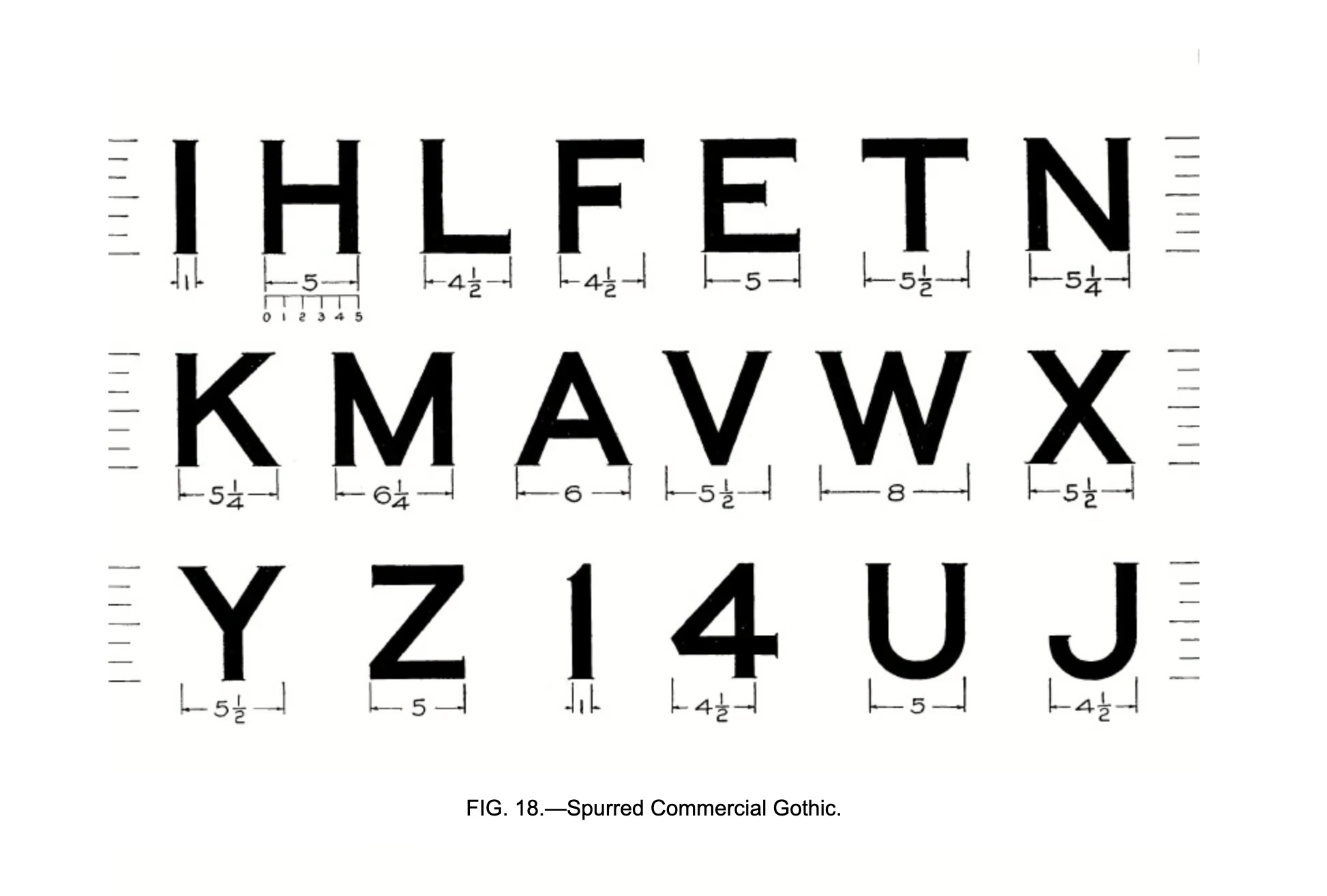
Everything was working fine, but I was still generating somewhat random letters, and their proportions weren’t the best. The issue was that I hadn't considered the varying proportions and sizes of different letters. For example, the proportion of the letter A is 6 points, while E is 5.5 points. Of course, different typographic systems define these proportions differently, but the key problem was that width proportions weren’t factored into my work.
At this point, I decided to revisit some articles on typography rules to find a more structured approach to letter generation. Since my research focuses on the balance between procedural typography and artistic freedom—with the goal of creating generative fonts that have a strong visual impact—I knew that once imported, these fonts needed to look good, especially in poster designs.
To refine my process, I used a spreadsheet from one of the articles as a reference tool to generate new letter variations more consistently.
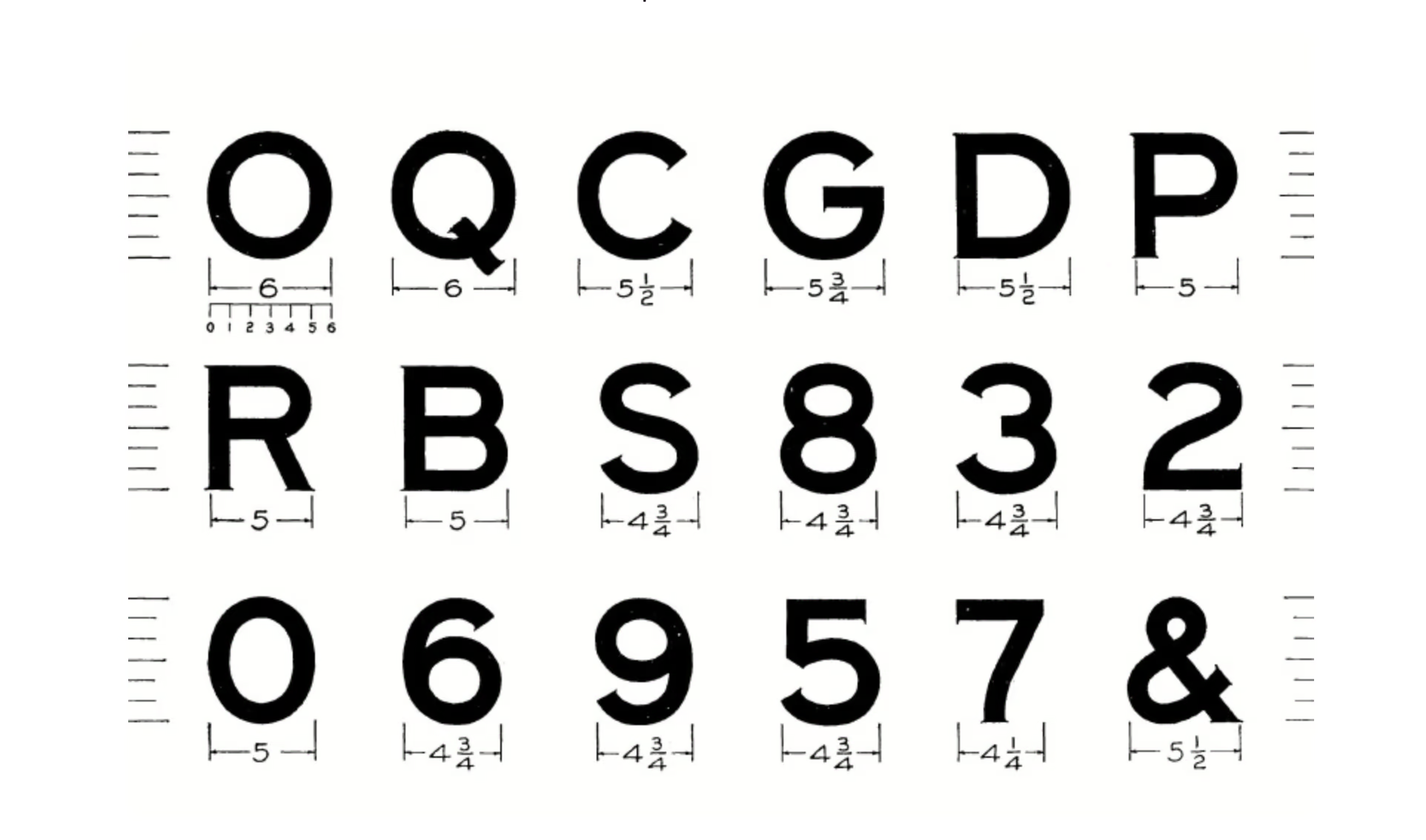
 Fonts Proportions - Source
What is my goal?
- Ensure that letters look like they belong to the same type family by maintaining proper proportions relative to each other.
- Introduce controlled randomness to make the letters feel more organic and unique.
- Align with my research question by combining typographic rules with artistic freedom.
- Make sure that while no two letters are exactly the same, they remain consistent in proportion and size, making them easy to use as a font across multiple projects.
Some Rules for Letter Generation
Besides maintaining consistent proportions, I also introduced controlled randomness to make the letters feel more organic and unique. Here are some key rules I established:
- Stem width – A global variable used across all letters to ensure proportional consistency. This was especially helpful for letters like B, D, E, F, I, J, and N.
- Horizontal line position on the Y-axis – Ensured that horizontal strokes aligned properly across letters, maintaining a cohesive vertical structure. This was particularly important for A, F, and E.
- Curved letter control points – Adjusted carefully to balance randomness with readability, preventing unwanted distortions in letters like B, D, and J.
- Diagonal consistency – For letters with angled strokes, such as A, N, and V, I ensured that their angles remained visually harmonious while still allowing slight variations.
By following these principles, I was able to merge typographic structure with creative freedom, generating letters that feel both systematic and expressive.
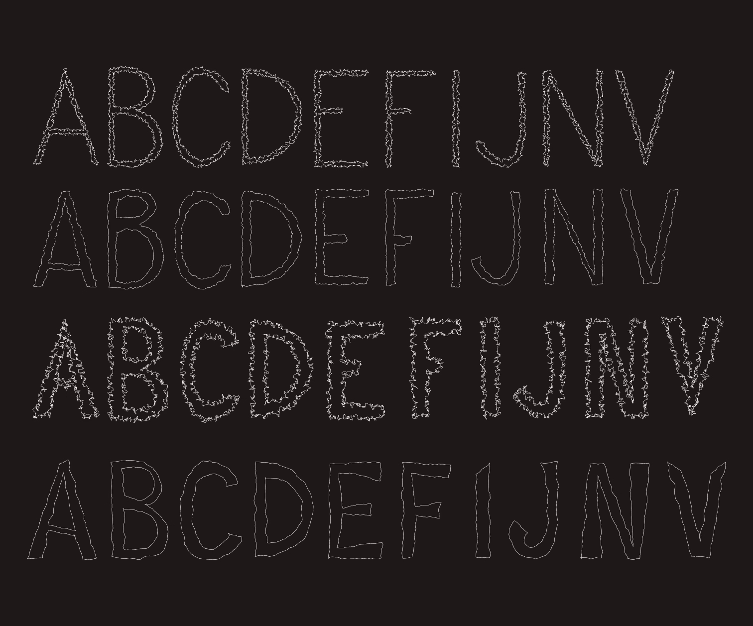
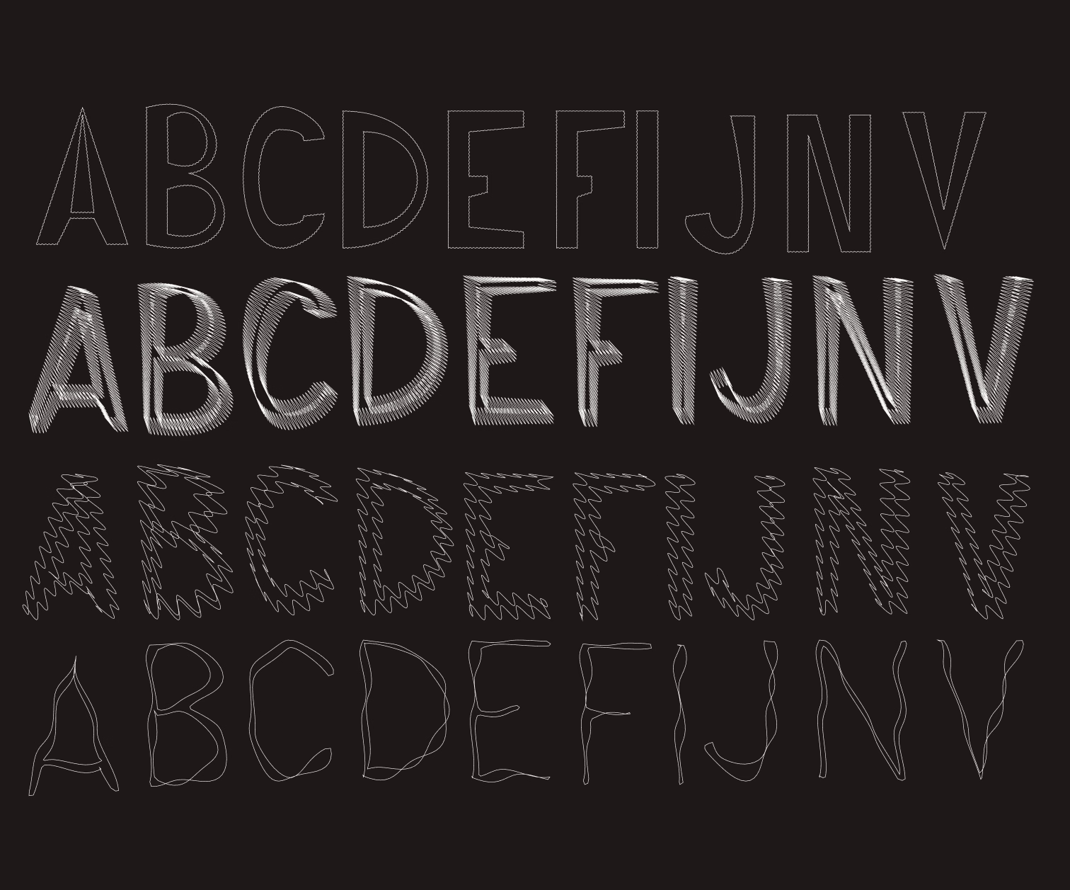
Additionally in my generative typography project, a key feature is the ability to deform letter contours, giving them a unique, organic appearance. To achieve this, I implemented two different deformation methods: using noise and sine functions. Each method offers a distinct aesthetic and dynamic. Within both distortion effects you can use:
- deformation slider --> connected to a parameter that controls the intensity or range of the deformation applied to the letter contours. So basically adjusting the deformation slider changes how much the contours of the letters are distorted. A higher value would result in more pronounced distortions, while a lower value would produce subtler changes. The noise function generates smooth, pseudo-random values that are used to offset the position of each point on the letter's contour.
- segments slider --> the segments slider is connected to the number of segments or points used to represent the letter shapes. Adjusting the segments slider changes the granularity of the shape's representation. More segments mean more points are used to draw the shape, which can make curves smoother and more detailed. Fewer segments might result in a more angular or simplified appearance.
Noise-Based Deformation
Noise-based deformation utilizes the Perlin noise function, which generates smooth, random values. This gives the letter contours subtle, organic distortions that resemble natural forms. Noise is good for creating effects that are unpredictable yet consistent and harmonious.
Sine-Based Deformation
Sine-based deformation relies on the sine function, which generates regular, wavy patterns. This method allows for more rhythmic and repetitive distortions, resembling sound or water waves.
Demo 02 Improved: Grid Typography
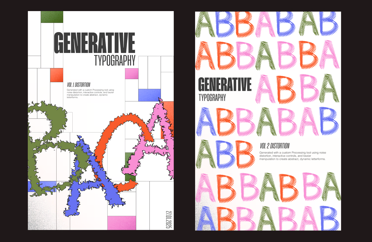
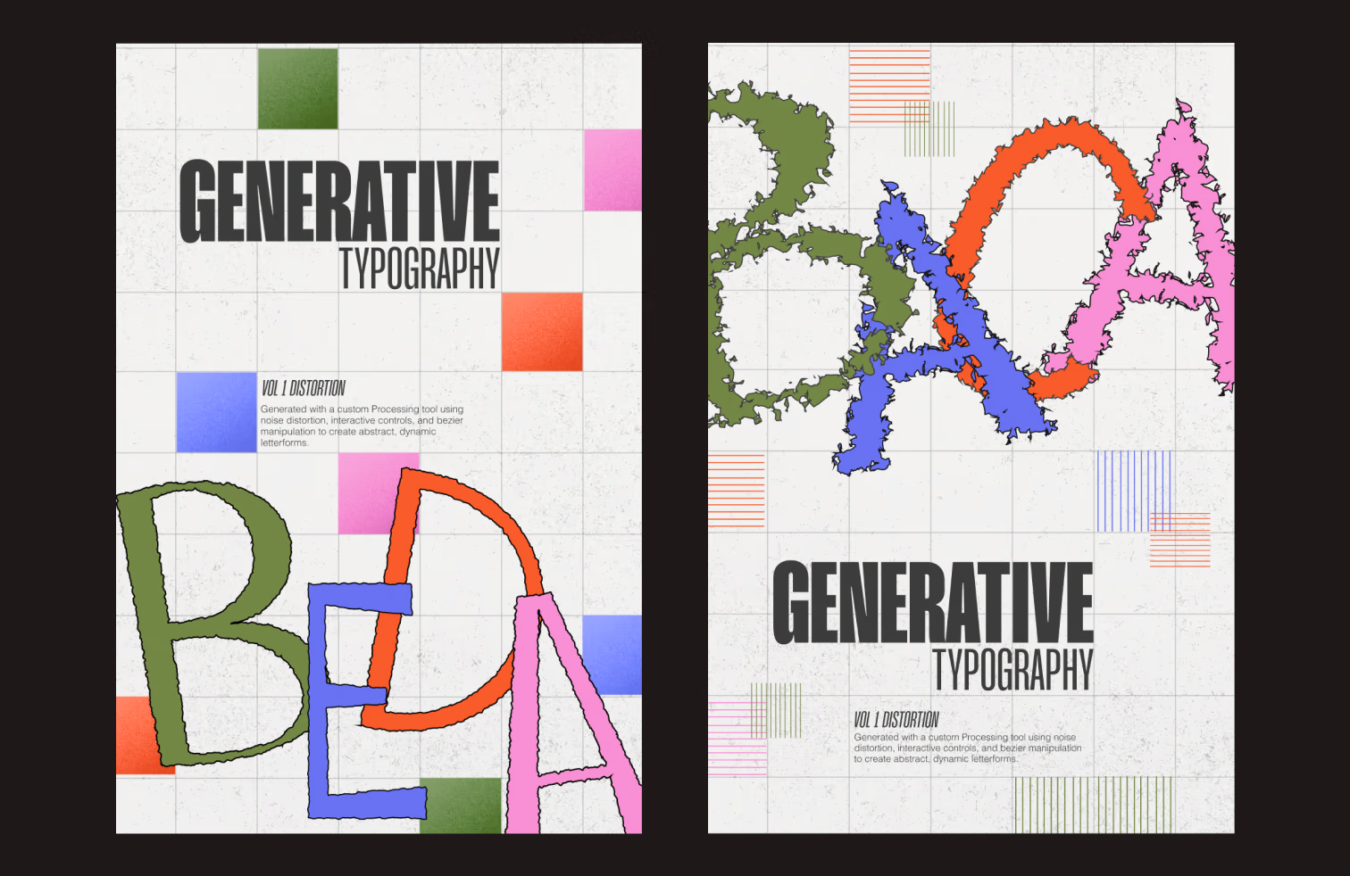
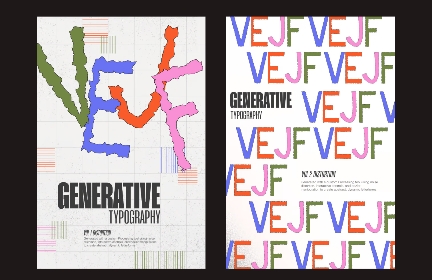
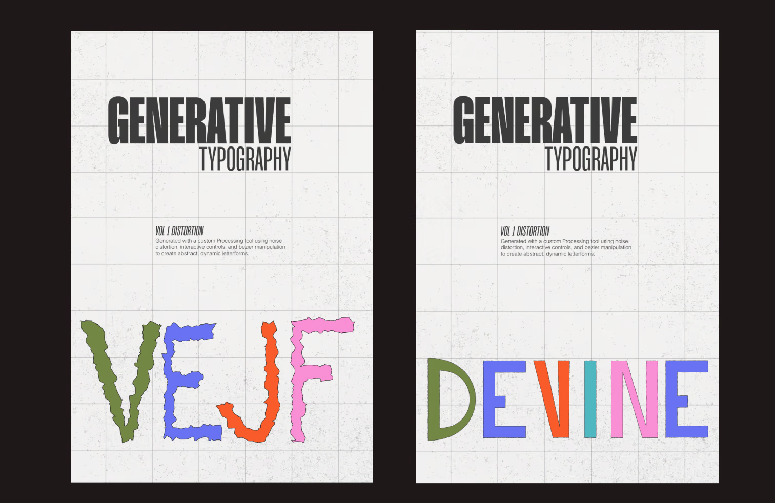
posters experimentations
Since I’ve created a set of letters, I wanted to see how they work in the context of posters. I thought it would be interesting to create a collection of posters featuring the procedurally generated letters. This could potentially become part of an exhibition, showcasing the intersection of procedural typography and artistic freedom in design.
Below, you can see some of my first iterations. Some posters still feature letters generated without proportional constraints, while others incorporate the rules I’ve introduced to create more cohesive letterforms. This comparison highlights the evolution of my approach and the impact of structured generation on the final visual outcome.