Research Question
How can procedural design combine typographic rules with artistic freedom to create generative fonts with visual impact?
Where to Start?
Generative art feels like an endless maze, full of possibilities where surprises often outweigh planned outcomes. Unlike other projects where I have a clear goal from the beginning, this time everything feels wide open. That’s both exciting and overwhelming because there’s no single right way to approach it.
I’ve realized that to make progress, I need to start somewhere—even if that beginning feels uncertain. My first hard-coded attempts ended as small successes, revealing challenges and helping me specify problems I might encounter later. That’s a win.
First Steps: Generating an Uppercase "A"
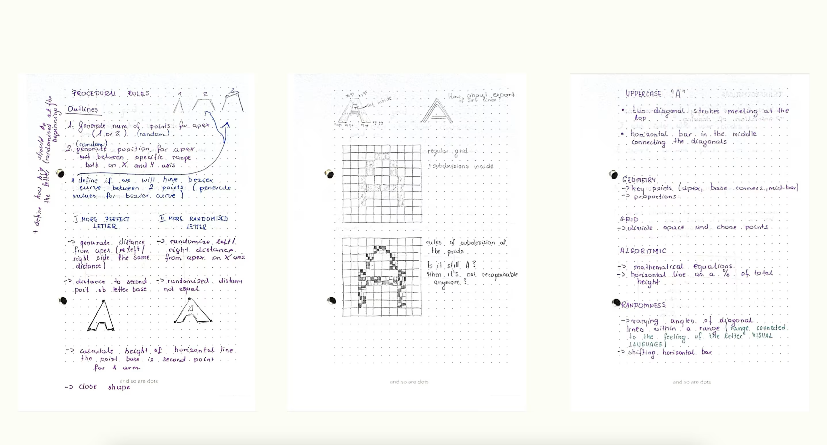
I decided to focus on creating an uppercase "A" procedurally. The appearance of the letter can vary wildly depending on what I want it to express, which made me feel unsure about how this will all work. To overcome this, I started by writing down some basic rules for constructing the letter "A" and then randomizing parts of those rules. The outputs I got were a mix—some were quite interesting, while others felt like they’d only fit in very experimental designs. And that’s okay because experimenting is the whole purpose of my project.
Below, I’ve outlined my initial process for generating a procedural "A."
Notes on Generating a Procedural "A"
1. Starting from the Apex
- The apex is the highest point of the "A."
- I decided to randomize whether the "A" has one apex or multiple apexes for more visual variety.
- When a second apex is generated:
- It follows rules for its position relative to the first apex (e.g., a max distance constraint).
2. Positioning the Apex
- The position(s) of the apex(es) are randomly generated but follow constraints to avoid extreme or unbalanced placements.
3. Perfect vs. Random Letters
- Perfect Letter: The distance between the letter legs and the canvas borders is consistent, creating symmetry.
- Random Letter: Each distance is independent, allowing for a more chaotic, experimental look.
4. Defining the Legs
- Each leg of the "A" is defined by two coordinates, both positioned on the baseline (same
yvalue): - These coordinates determine the placement and angle of each leg.
- The first coordinate connects to the apex.
- The second coordinate marks where the leg ends on the baseline and is connected to the horizontal line of letter.
- These rules ensure the "A" shape remains valid (important for importing into tools like Glyphs App) and forms a closed outline suitable for a font glyph.
5. Placing the Horizontal Bar
- The horizontal bar (the crossbar of the "A") is placed randomly within a specific percentage range of the letter’s height.
6. Inner Triangle (Hole of the "A")
- An inner triangle is created as a contour to cut the hole inside the "A."
- Rules were defined for its position and size to maintain balance within the letterform.

1st Itteration
2nd Itteration
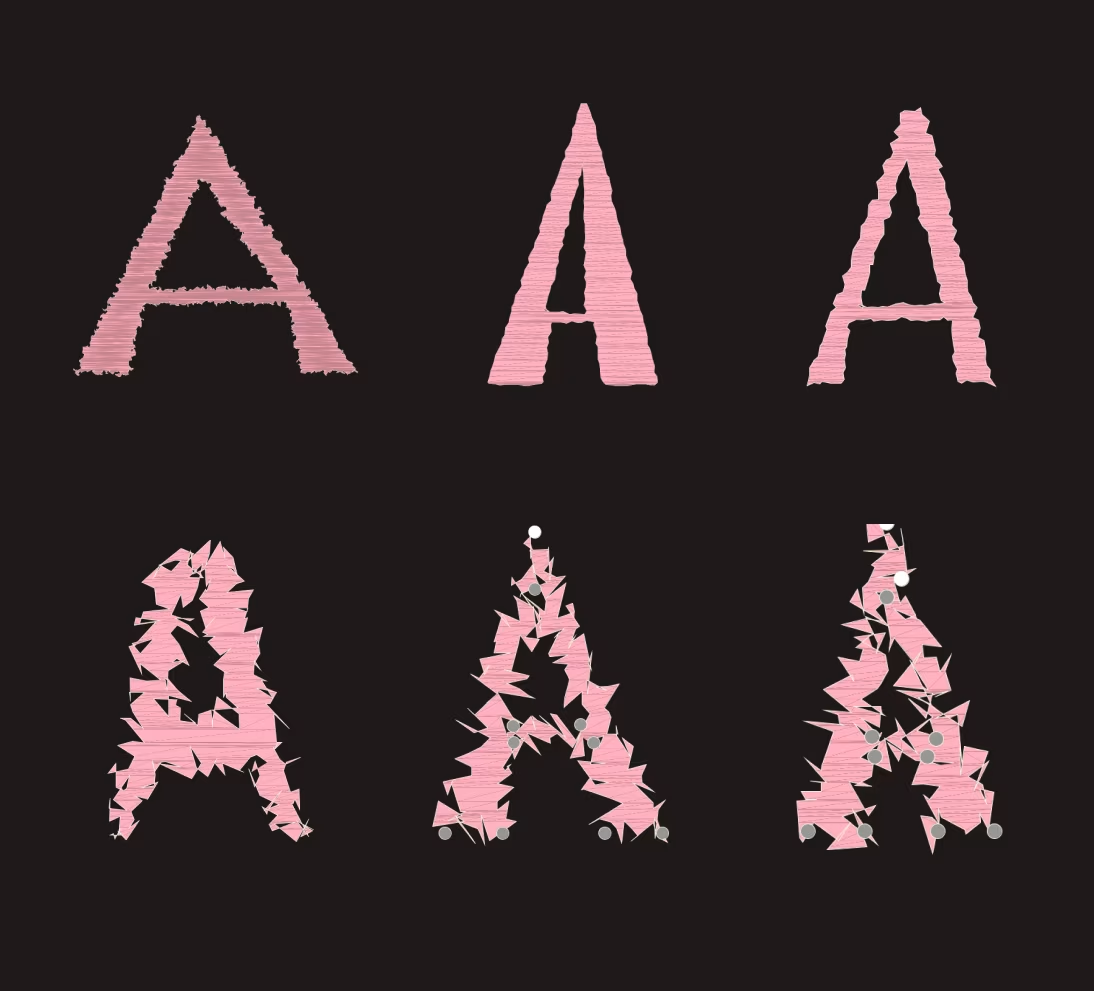
In my first attempt at generating the letter "A," the results were inconsistent—some were visually interesting for experimental designs, but others felt unusable. I realized that while randomness was exciting, it needed refinement to avoid pure chaos.
To address this, I introduced adjustable controls for key elements of the letter. These allowed me to fine-tune specific parts while preserving the generative nature. The aim was to balance randomness with structure, combining artistic freedom with typographic rules.
After each adjustment to the letter, I exported it as an SVG to see how the outline changed automatically. This gave me immediate feedback on how tweaks, like repositioning the apex or adjusting leg angles, transformed the design, making each version feel unique and dynamic.
3rd Itteration
I started using the Geomerative library to work with RShape objects, which made creating and modifying my letter designs so much easier. Converting shapes to RPolygon allowed me to add noise-based distortions, bringing a fun mix of randomness and dynamic effects to the letters.
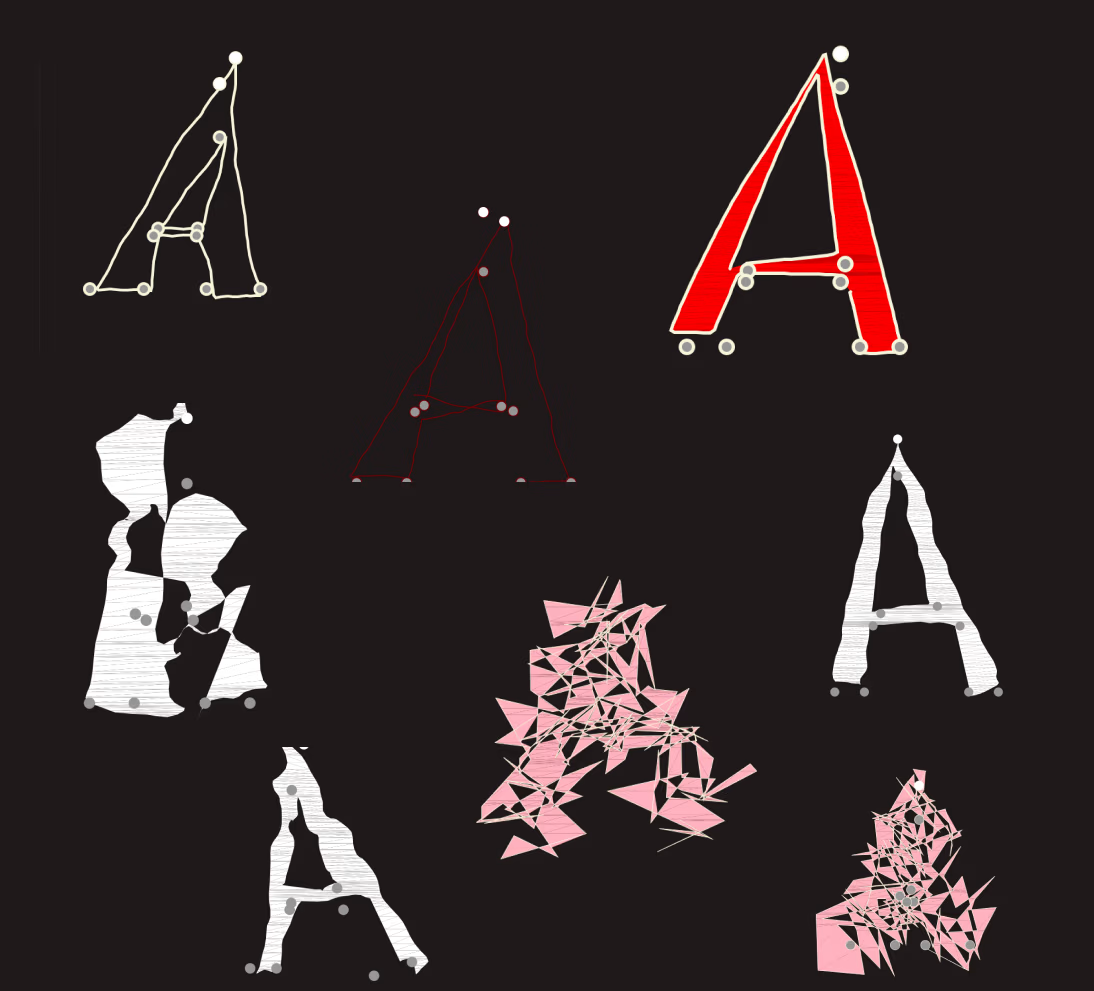
I also continued using draggable control points to tweak key parts like the apex, legs, and horizontal bar in real-time. Combining these tools with animated distortions and SVG export made the whole process feel intuitive and creative, turning each letter into a unique and evolving design.
Using noise, I applied dynamic distortions to the letter outlines, transforming the structured shapes into organic, unpredictable forms. By mapping noise values to the polygon points, each letter evolved with unique deformations, creating a balance between randomness and control. The draggable control points added another layer of interactivity, letting me refine key features in real-time while still embracing the generative chaos.

I experimented with extreme outline deformations to see how far I could go before the letter "A" stopped being recognizable. Some results were successful, maintaining just enough of the original form, while others completely lost their identity as a letter. Even the less successful attempts felt important to include—they’re part of exploring how structure and randomness can intersect, and they help define the threshold where a letter ceases to be readable. It’s all about observing what works and what doesn’t.

This video shows how letters transform in two steps: first, you adjust their shape with control points, and then a deformation animation adds randomness, creating unique, dynamic results.
Demo 01: Generative Typography Exploration
Overview
This demo explores how procedural design and interactivity can shape generative letterforms. Using Processing, the sketch generates a dynamic letter "A," allowing users to manipulate distortion, segmentation, and colors interactively.
Features
- Interactive Controls:
- Adjust distortion intensity and segmentation via sliders.
- Choose from predefined colors (Pink, Lime, White, Red) for stroke and optional fill.
- Enable/disable fill with a toggle.
- Dynamic Geometry:
- Letterform constructed from procedural apex points, diagonal legs, and inner triangles.
- Real-time distortion using Perlin noise.
- Customizability:
- Drag control points to reshape the letterform.
- Export designs as SVG for further use.
How to Use
- Run the Sketch: Open the
.pdefile in Processing and click "Run." - Customize:
- Use sliders to tweak distortion and segmentation.
- Select stroke color and enable fill if needed.
- Drag control points to modify shapes.
- Export: Click "Save SVG" to save your design.
Future Work
This demo sets the stage for exploring generative fonts. Next steps include grid-based typographic constraints, enhanced distortions, and parametric designs.