After general research about generative art tools and finding visual ispirations. I started with exploring typography basics.
In order to do something meaningful with letters I need to have a little deeper understanding of letters design.
I began by researching typography to revisit basic terms and rules. From there, I explored variable fonts and their significance in web development. However, I quickly realized that my initial research question was too broad.
I had combined everything I enjoy—typography, procedural patterns, 3D transformations, shaders—into one idea, thinking I could create a tool encompassing all of them.
As I delved deeper into typography, I discovered its vast scope and potential, which made me realize there’s enough to focus on within this single topic. I decided to narrow my primary focus to typography and grid systems, with generative visuals playing a secondary role.
After consulting with my coach, I explored Glyphs App. Designing fonts is a complex challenge, and I’m not a font designer. However, I saw the potential in creating procedural fonts as a unique experiment. I also considered variable fonts, but there are already many tools online for manipulating them, and I didn’t want to repeat existing solutions. Additionally, Processing doesn’t support variable font manipulation, making this direction less valuable for my goals.
I then shifted my idea to generate procedural fonts based on distinct rules. The idea is to design a single letter procedurally in Processing, then use those rules to generate an entire alphabet. This output could be exported as SVG outlines and refined further in Glyphs App to create a complete, cohesive font. I’ll need to experiment extensively to see what’s possible and determine the creative of this approach.
My research process
I started from understanding what typography really is:
- typography is the art of arranging letters and text in a way that makes the copy legible, clear, and visually appealing to the reader
Then I recalled basics of different parts and terms used in typography:
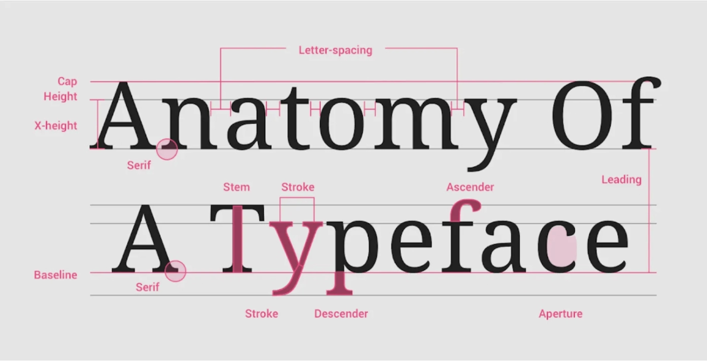 Understanding typography Material Design - Source
After revisiting the basics of typography, I moved on to Joseph Müller-Brockmann's book, Grid Systems in Graphic Design, to understand the fundamental principles of grid systems. According to the book, the main goals of a grid are to ensure functional layout, a sense of structured planning, clarity, and orderliness in design.
However, this traditional view presents grids as something precise and perfect. It made me question: What happens when grids are no longer just functional? What if I approach grids with a more abstract perspective, using them as a creative foundation for procedural font generation?
While I want to explore abstraction in grids, there’s a balance I need to maintain. The letters I create must still remain recognizable. This tension between clarity and experimentation is something I’m eager to explore further, pushing the boundaries of grids while trying to keep the essence of typography intact.
The next part of the book that really stood out to me was seeing two different approaches to letter design. One focused on purpose and function, like the Olivetti grid for practical use, while the other emphasized precision and beauty, like Neudörffer’s geometric letters. This contrast is relevant to my work as it highlights how grids can serve both functional and creative goals, which is something I want to explore further in my procedural font experiments.
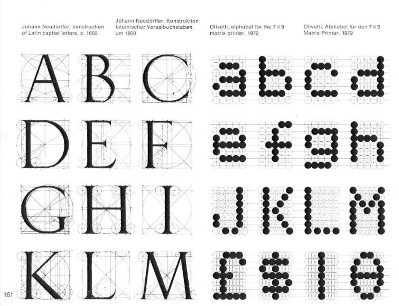 Grid Systems in Graphic Design - Source
Next steps
I was still researching grids and typography when Marlon Ilg's Grid Fraktur Font really caught my attention. Even though I’m not working with variable fonts myself, the way he integrates a grid into the typeface and reimagines a historical style like fraktur is such a fresh perspective. It shows how grids can do more than just organize—they can transform and modernize typography. This project is a great inspiration for me as I explore the relationship between grids and typography in my own work, pushing me to think differently about how structure and design can interact.
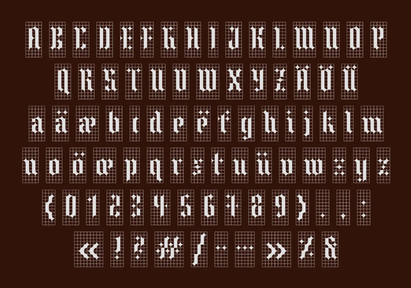 Grid Grid Fraktur Font - Source
HOW ABOUT LETTERS?
As I dive deeper into creating procedural fonts, having a solid understanding of how letters are constructed is very important. The chart I referenced categorizes letters by their shapes (like round, rectangular, or diagonal) and specific features such as ascenders, descenders, and width. This is especially useful for me at the start of my project when I aim to recreate fonts without adding deformations or randomness. It gives me a clear structure to follow.
For example, letters like G, S, and C are mostly round, while letters like E, F, and H are rectangular. Knowing this helps me build these letters with simple geometric shapes. Understanding features like narrow vs. wide letters or how lowercase letters include ascenders and descenders also ensures my fonts follow recognizable typographic rules.
This framework will guide how I structure my code, especially when working with grids and basic shapes. Starting with these principles gives me a strong base to create functional and readable fonts before experimenting with randomness or artistic effects. This balance between structure and creativity is key to my project.
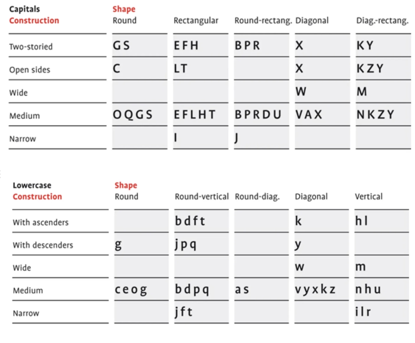 Letters Classification - Source
Testing SVG Export with Processing
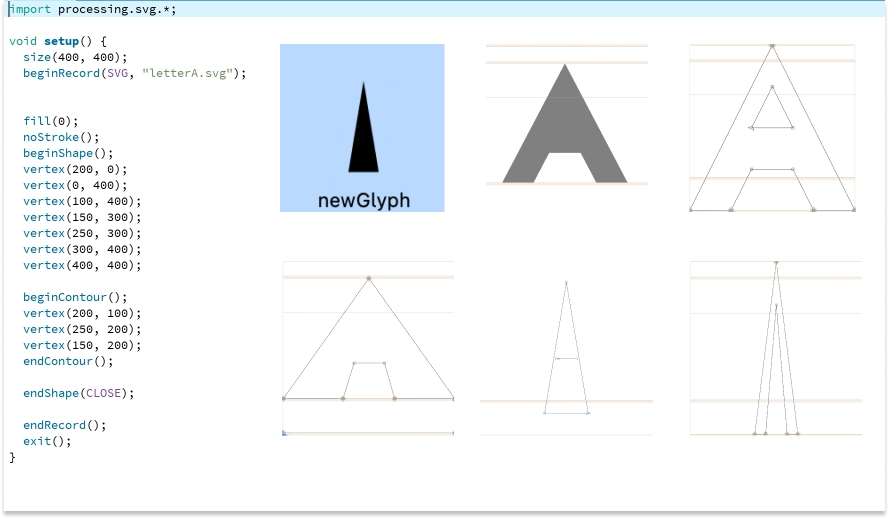
After conducting research and forming an idea, I faced the pressing question: "Will this actually work?" While I understood that my research aimed to explore the feasibility of my approach, I decided to run a quick test to validate the process. Knowing that Processing offers a robust option for exporting SVGs, I wrote a simple sketch to export a hardcoded letter "A."
Initially, the exported SVG included a background, which I had to manually remove in Glyphs App. To begin testing, I started with a basic triangle to see how it would function within the Glyphs software. Next, I created a version of the letter "A" using lines. However, the lack of closed outlines caused Glyphs to fail in detecting it as a valid glyph.
To resolve this, I created a closed outline of the letter "A" with variations. While this solved the detection issue, another challenge emerged: after importing the SVG into Glyphs App, I needed to manually resize the letter to align it with the baseline, x-height, and cap height.
This raised an important question: is it possible to adjust the settings in Processing to ensure the exported letter automatically matches the baseline and general typographic rules defined in Glyphs App? If the settings in Glyphs App can be referenced, it may be feasible to automate this alignment directly during the export process, saving time and ensuring consistency.
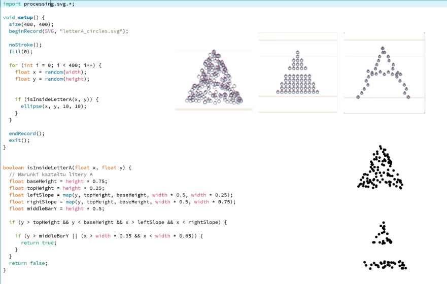
Later I experimented with creating the letter "A" using circles. At first, the results looked more like a Christmas tree because the rules for defining the shape weren't precise enough. By refining the mathematical rules and adding slight randomness, I was able to recreate the letter "A" with a clearer structure.
This process highlighted the challenge of balancing defined rules with randomness to maintain both structure and the generative art aspect of procedural font creation. The experiment showed progress but also revealed the complexity of integrating randomness into font generation while keeping the design recognizable.
Exporting Letters as a Font
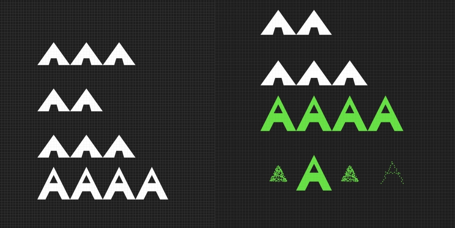
The final step was exporting the generated letters to test how they work as part of a proper font. However, as expected, the letters were not properly adjusted to the baseline, and the spacing between them (kerning and tracking) was off, causing them to overlap and look unnatural. To fix this, I adjusted the settings in Figma, which helped align the letters and refine their spacing.
The image below shows the progression of my experiment. It is a very raw demo, created just to see how the process might work. I am fully aware that there is still a lot of work ahead to refine and improve this further.
Sources
- Letter Fountain. (n.d.-b). https://www.letterfountain.com/drawingtofont.html.
- Müller-Brockmann, J. (n.d.). Grid systems in Graphic design.
- Introduction to variable fonts on the web. (2018, February 19). web.dev. https://web.dev/articles/variable-fonts
- Marlon Ilg talks us through turning a found typeface into a variable font with a modular grid. (2025, January 9). https://www.itsnicethat.com/articles/studio-marlon-ilg-graphic-design-040821
- Hannah, J. (2023, May 10). Typography: What is it? The Complete Guide for 2025. CareerFoundry. https://careerfoundry.com/en/blog/ui-design/beginners-guide-to-typography/
- Material Design - Version 2. (n.d.). Material Design. https://m2.material.io/design/typography/understanding-typography.html#type-properties
- Adobe Creative Cloud | Sign in. (n.d.). https://creativecloud.adobe.com/cc/discover/article/typography- 101-a-crash-course-of-terms-to-know?locale=en
- Letter Fountain. (n.d.). https://www.letterfountain.com/drawingtofont.html